As we've done every year since 2004 (except, for some reason, in 2017), SPB's hard-working staffers have beavered away around the clock to deliver you a set of lists to help you review the year just finished. Not a list of our favorite albums—you can peruse that here—but all kinds of other things we discovered in 2023.
Read on to hear about the best artwork, musicians we lost, live shows, covers, Europunk, and of course, "Canadian releases to phone your mom about". Don't say we don't spoil you here at Scene Point Blank.
— The SPB team
Best Art of 2023
This list has become a returning feature that I really enjoy making. As we are doing this for the fourth time I can start to see a couple of trends. What I noticed first is the absence of space themed cover art. In previous years I included loads of that kind of art. I wondered about the cause and came to the conclusion that a) there was less art in that category and b) the art in this category was less brilliant than in previous years. This year art that reminds me of graphic novels/comics are hot. Perhaps that correlates with the amount of comics I have read this year, but I like to think that doesn't influence me that much.I do feel that 2023 was not the best year when it comes to artwork. Overall a lot of art left me unimpressed. Luckily, the pieces that really caught my attention compensated for that. I also discovered more than one band because I wanted to check what music came with the beautiful art, which speaks for the importance of a good cover.
Anyway, you are not here to read my elaborate thoughts on trends, so without further ado I am proud to present the best artwork of 2023. The list is in random order, but to me, Deadly Carnage (or, more precise: Alexios Ciancio for Ciancio Graphics) is a clear winner with their beautiful cover.
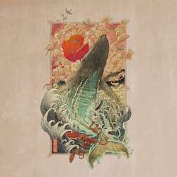
Deadly Carnage - Endless Blue
This year I discovered Deadly Carnage because I really, really wanted to know what the band that has this amazing artwork sounds like. Singer Alexios Ciancio (Ciancio Graphics) can take credit for getting me on board. Luckily for me the music did match up with the gorgeous artwork. I return to the album often and always marvel at the art. I am a sucker for a good drawing of magnificent animals such as a whale. The Japanase feeling matches with the Japanese myths that are dealt with in the lyrics. The muted color scheme is near perfect. This is by far the best art I've seen this year.

Bankrupt - Illiberal Holiday
Vass Richard did some amazing work on this cover for Bankrupt. If you think this is it, you are absolutely wrong. Every track on the album has it's own cover and they are all good or great. Amazing stuff!
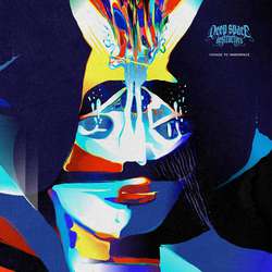
Deep Space Destructors - Voyage To Innerspace
As I read a lot of graphic novels/comics I am a sucker for artwork that reminds me of that hobby. Markus Räisänen got exactly the right vibe to combine that graphic novel feel with some spacey, slightly psychadelic stoner like Deep Space Destructors. It is a mariage made in heaven.
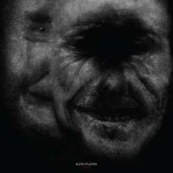
KENmode - Void
Randy Ortiz made the art for Void, the latest KENmode album. Where his work for the previous album was already pretty good, he outdid himself on this album I appreciate this for two reasons. Firstly, it is absolutely horrifying. It scares me every time I see it as it really is the stuff of nightmares. Secondly, it truly encapsulates the dark sound of the album. It is this combination of music and artwork that lifts it above the rest.

Hoy Es Siempre Todavía - El Mapa de Mi Albedrío
The Braves Church made the artwork for Hoy Es Siempre Todavía's album El Mapa de Mi Albedrío. An album title that (Google translate tells me) translates to The Map Of My Will. It is no more than logical that this translates to a map. And it is and isn't and I just love this kind of playing around with your perception. Once you see it you can't unsee it. Or well, I can flip back and forth in what I see, but you catch my drift. An excellent piece of work that brings that little bit of extra to put in on this list. I also need to compliment the choice for the font chosen and the placement. It really blends in and adds some depth (opposed to what we see too often: (pretty) artwork with loveless bandname/album title smacked on it).

Satón - A La Espera Del Momento
This one is intriguing to me. This picture is serene and threatening at the same time. At first I thought: poor bird! It dawned on me then that the bird showed no signs of pain or despair. It appears to me more as a display of a serene beauty, it is flaunting it's golden fiery wings and confidently so. At the same time that beauty is kind of threatening. Not the beauty itself, but the fire. Fire, no matter how beautiful it can be, is a source of danger. That combination is perfectly captured by Daniel Vega for Satón's album A La Espera Del Momento, an album that combines the same two qualities as the artwork.
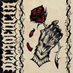
Decadencia - Demo
I can not say I am a big fan of tattoo art as an album cover. Except when it is done exceptionally well. Lourdes Santonja did just that for Decadencia's Demo. It is not too crowded, which is for the best if you ask me. It also nicely contrasts something hard (the glove) with something more soft (the flower). On a second thought: perhaps that glove is needed because of the thorns? Anyways, what makes it stand out is the use of color. To be more specific: to use only one color. This brings a certain dynamic to the art that is priceless.
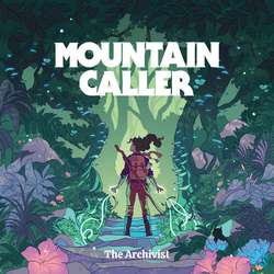
Mountain Caller - The Archivist
Mountain Caller is a band I discovered because their artwork called to me. I really enjoyed the art of their debut album. On the EP that followed the band used a different artist, who also delivered something amazing, but it did not speak to me as Hannah Templers work did. I am delighted to see their second album (which will be released early next year) will be adorned with her beautiful work again. I am cheating a bit to include this already on my list, but since the single The Archivist (which uses the same artwork) is released this year I do not feel too guilty about it. This type of artwork oozes graphic novel vibes (not very strange considering Hannah Templer works on comics as well). It feels as though it is part of a story. As Mountain Caller is telling a grand tale with their music that feels as a perfect match. It is a shame that the album art is only part of the whole picture. I encourage you to look for the whole picture.
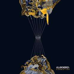
Allochiria - Commotion
A small part of my job is interviewing people. During those interviews I've found that silence is an exceptionally important part of the art of interviewing. When I started I wanted to fill the silence, so I talked and talked. Over time I learned to use silence as a tool to let the other person speak, elaborate on their previous answer without directing them into a certain corner. I think the same can apply to art. I mean: give someone a blank page to fill with art and what do they do? They fill it to the brim. Sometimes, less is more though. Ultragrim Dis-sign understood that and played around with empty space in his design for Commotion, Allochiria's third album. Combined that with the use of a very limited color set and you get this absolute gem of an album cover!
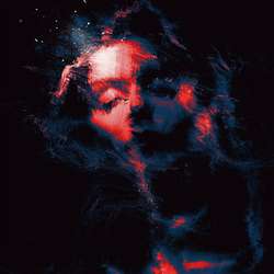
Summer Haze '99 - Inevitable
Fany Sejati designed this albumcover for Summer Haze '99, one of the many projects of Erech Leleth. This project is a strange concoction of post-black, blackgaze and some kind of pop-music. It is a strange brew, but it works well, especially closing track "Voy Con Libertad" is a real gem. The music invokes a kind of hazy, warm atmosphere. An atmosphere Fany Sejati converted to a beautiful visual. It is warm, yet also just vague enough encourage your imagination. The colors used are brilliantly chosen and add further warmth and depth to the art.
- Dennis
