Top 10 Worst Pieces of Album Art of 2012
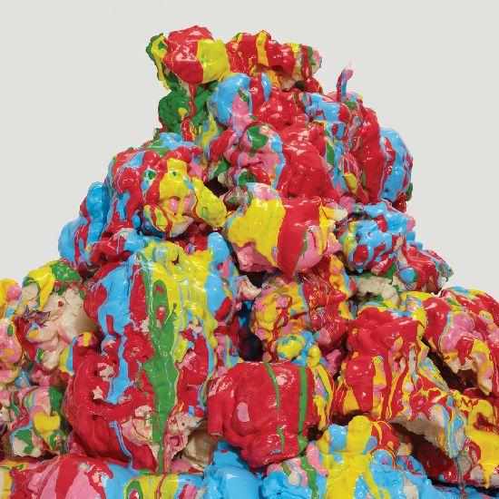
Battles - Dross Glop
Okay: this should perhaps receive some sort of bonus point for being colourful, macro-scale and constrasting, a little like Battles' music, but in general, this artwork looks like what would happen if the My Little Ponies were brutally murdered, with their rainbow-soaked brain matter left congealing in a pile as nearby kids scream and cry uncontrollably. Even the still image holds a sense of foreboding, as though a terrifying dayglo clown is about to spring out of the pile, covered in primary colours and masturbating uncontrollably. Sickening.
Broken Heroes - This Is Oi!
This is Oi? This is fucking predictable, more like. Don't Rancid own the copyright on that font, too?
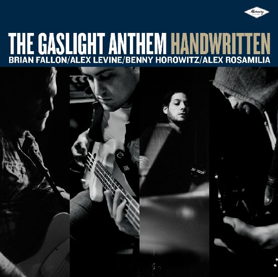
The Gaslight Anthem - Handwritten
What the fuck is this, the Backstreet Boys? Since when did bands list the members' names and photos on their covers? Even the fucking Beatles didn't do it as directly as this. It doesn't even look like an album, either, but one of those cheapo compilations you see in record stores called something like "Sound of the Sixties: Simon & Garfunkel's Greatest Hits" which manages to not include any of the band's well-known songs.
Green Day - ¡Uno!, ¡Dos! and ¡Tre!
Ugh. This aesthetic was old hat ten years ago, let alone in 2012. The crosses-for-eyes thing is as played out as substituting love hearts for bombs, and it irrationally bothers me that the angle of the text for ¡Tre! isn't the same as the other two. Also, why is Mike Dirnt so important that his heads gets to cover up some of the band logo, but not the other two? It's definitely not because it's the best of the three (it isn't).
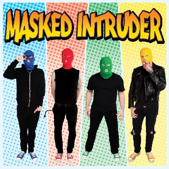
Masked Intruder - Self Titled
Making all of the band members look alternately like murderers and rapists is a bold marketing tactic, but gimmicks aside, this just looks stupid. If it was the Ramones thirty years ago it might've been cute and bubblegum, but here it just feels forced and tacky, down to the colour-coordinated Converse each guy is wearing. I bet they play live in these outfits too, don't they?
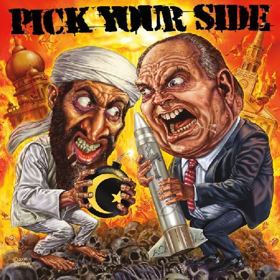
Pick Your Side - Let Me Show You How Democracy Works
Seriously.
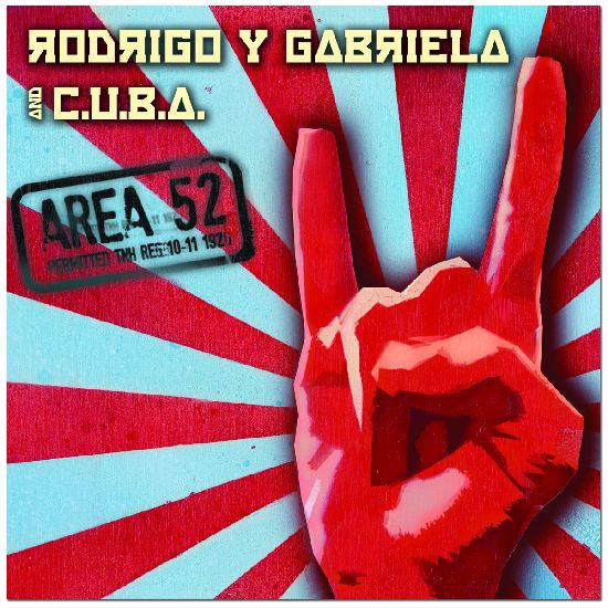
Rodrigo y Gabriela - Area 52
Did they commission a just-starting-out Graphic Design 101 student for this? Each bit of it smacks of "hey, look at this awesome Photoshop filter, bro!", down to the faux-Cyrillic typeface and cheesy ink stamp effect.
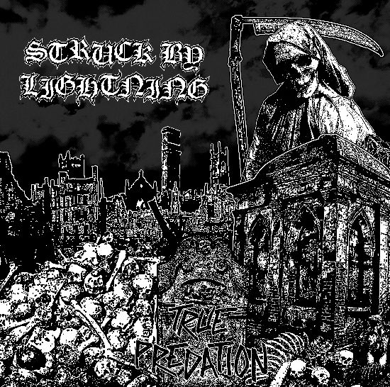
Struck By Lightning - True Predation
Another wannabe Rancid typographer must've designed this one. They should've given the Grim Reaper a mohawk and be done with it.
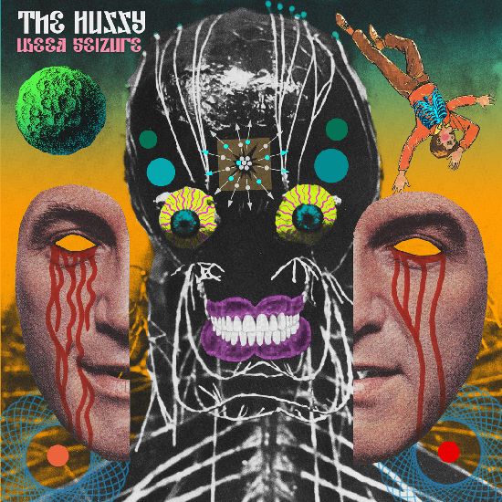
The Hussy - Weed Seizure
Maybe I'm taking the bait here but this is just painful, unless it's meant to be a spoof of a Mars Volta cover, in which case I'm down with it. Come on guys, the fucking face isn't even symmetrical. Also, are they boobs in the corners?
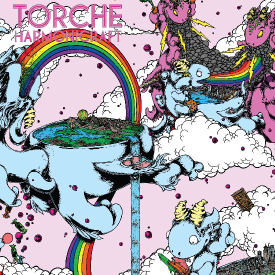
Torche - Harmonicraft
Actually, you know what? This features a bunch of cute flying dragons(?) vomiting rainbows into idyllic Discworld-esque floating planets, and alternately duelling scary-looking pink versions of themselves whose belching thunder/lightning clouds threaten to wipe out an Earth-like city. Fuck it: this is the best album cover of 2012.
- Matt
