1. Five Alive (Citrus)
Five Alive kept me alive in the 'o five. I found its incomparable blend of citrus products to be perfect, no matter what my mood was. Whether I was up early in the morning for work, or if I was chilling out at home with my crew. This was the year that Five Alive truly proved itself to be king of my personal beverage world. Furthermore, I was extremely disappointed to find that similarly titled products did not yield the same delicious taste. Sun-Rype's Hi5, for one. Nice try, assholes.
2. Pepsi (Canned)
Sometime earlier this year I realized that Pepsi is actually one of the most underrated drinks on the market. This is a travesty. I find it to be a smoother drink than Coke. Less in your face, but twice as good. When bottled, the drink loses some flavor. My suggestion: buy a six-pack of mini cans, and save each one for a different sitting.
3. Orange Julius (Regular)
The Orange Julius is a classic for a reason. Its blend of crushed ice, oranges, and that secret ingredient was a lifesaver on those rough nights alone at the mall. While it wasn't the best drink to accompany a meal, it was the best stand-alone beverage I tasted this year. It's a noble drink to be enjoyed at a noble pace.
4. Fanta (Orange)
I know what you're thinking. "Giles, enough with the citrus!!!11" Well, I tell you what. My trip to Europe this year would only have been half as good if not for all the Fanta I drank. Drinks like Orange Crush have similar flavors but lack the right kick. And it gets bonus points for coming in a neat bottle.
5. Chocolate Milk (Nestle)
Nestle Quik not only tastes great on ice cream. It also makes the most exciting chocolate milk ever. Nothing beats the experience of squirting some brown gold into a fresh glass of milk, and stirring it up until the color is just right. Me, I like a darker, richer glass of chocolate milk. But I could understand someone preferring a lighter blend. Dudes, it's just milk.
- Giles
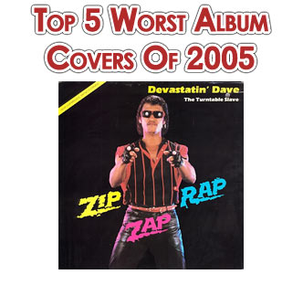
Despite last year's predictions, the Mars Volta didn't make this year's list. Not that their last cover art was anything mindblowing, but the examples of awfulness given to us this year have been so far beyond the realms of lameness that it was difficult to narrow it down to just 5 choices. Without further ado:
 Andrew
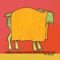
Bird - The Mysterious Production Of Eggs
What the fuck is this? As if the album name itself wasn't strange enough, in place of cover art we get a drawing that looks like something out of Dr Seuss.Would you honestly feel all cool and tough buying this at your local record store? Yeah, I thought not. The clerk would just look at you and laugh. I mean, come on. It's a green llama with an orange tent on it's back. Oh, and the tent has earholes. Perhaps in llama fashion circles this is considered a good look, but I'm not a llama, and presumably neither is most of Andrew Bird's record buying public, so why the bizarre association? The only other conclusion I can come to is that Andrew Bird must in fact be a bird, an animal which is clearly well aware of the developments in mammal boutique fashion.
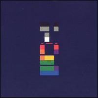 Coldplay
- X&Y
I dislike Coldplay. It's not because of Chris Martin's Bob Geldof-esque charity concerns. It's not because Chris Martin named his kid Apple, and somehow got to bang Gwyneth Paltrow into the bargain. It's not because of Chris Martin. It's because they're boring. Where's the rock, Coldplay? It makes sense then, that this album cover is less 'rock' than any record ever released. In fact, it's difficult to say exactly what this cover is. The scientists amongst us will no doubt explain that the title X&Y relates to the female and male chromosomes, and the image on the cover is a digital representation of a chromosome. To the scientists, I retort: No, the cover image is the personification of boring. Chromosomes? No, a pixellated rainbow that at certain angles seems to represent Santa Claus with a multicoloured beard.
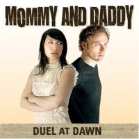 Mommy
And Daddy - Duel At Dawn
I've never heard this band, so I'm not sure if the two B-Movie wannabe figures depicted on the cover are in fact, Mommy and Daddy, or just two over-acting extras. Either way, a bad Photoshop job teamed up with Microsoft's WordArt doesn't do much for a cover. And as for the name - where's the fucking duel? Any readers experienced in the ancient art of duelling will laugh instantly at the poorly attired figures here. 'Mommy' in particular doesn't look ready for a duel whatsoever, and in any case, where are the duelling weapons? No maces, ninja throwing stars, nunchucks or even a broadsword? Lame duel bro. I'm also not down with the facial expressions. Mommy seems to be giving Daddy a look that says "Here we go again..", as Daddy stares hauntingly into the distance, probably seeing his duelling enemy approaching, decked out with weaponry. Bet ya wish you packed some daggers now instead of a frilly dress and a Coldplay haircut.
 Queens
Of The Stone Age - Lullabies To Paralyze
More WordArt album covers, and a photo that looks like something out of Are You Afraid Of The Dark? No, I'm not. 0 points for effort.
 Sugar
Eater - American Idle
Oh, cute, an American Idol pun! Oh wait, Green Day already got there. This cover looks like it was whipped up using Microsoft Paint, suggesting to me that the band themselves sound like a poor man's Green Day. Oh, and the font of the record name sucks too. I hate to sound like a failed designer, but the only way it could be worse would be if they'd used Comic Sans instead. Lastly, it's two thousand and fucking six, nobody has those TVs with the pointy ariels on top anymore. Get with the program.
Special Mention:
 Ian
Brown - The Greatest
When your face resembles a monkey in need of a razor, it's probably not the best idea to slap it on the front of your record.
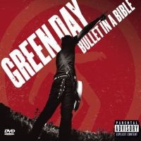 Green
Day - Bullet In A Bible
Could they make it any more obvious that the main audience for this record/DVD is the teenage girl market who are in love with the cute little boy in eyeliner known as Billie Joe Armstrong? Wait, what? You mean there's more than 1 member in Green Day?
- Matt
