We've told you all about the best music you might have missed from 2021. We've asked the artists and labels who brought us that music to reflect on the twelve months just passed, and what they expect for 2022. But there's still room for more reflection! Here are our team of writers to tell you about other amazing things you may have missed from 2021 – including EPs (metal, punk, hardcore and more), songs you might've missed, amazing album artwork, and even something about a little-known group called the Beatles who released a film. Read on for our Year In Review!
Best artwork of 2021
The artwork that accompanies a record is important to me. It can make my enjoyment of a record even greater and sometimes it makes me want to check something out (even if the description already tells me it is not for me). I am happy we can share the best artwork we have spotted this year.

Vokonis
Odyssey
At the time of writing I have not yet listened to this record. I am sure I will though, and the artwork is the main reason for that. I mean, look at it, it is magnificent! Kyrre Bjurling did an amazing job with loads of vibrant colours.
- Dennis

Toska Fall
It Falls Apart
I am going to quote my own review on the artwork for the artwork of It Falls Apart, Toska Falls debut EP: The artwork deserves some special attention. It is a nice modern play on the classic Vanitas themed still life. There are plenty of hints towards the temporal nature of existence. A nice twist to this old theme by Jacek Selanski.
- Dennis
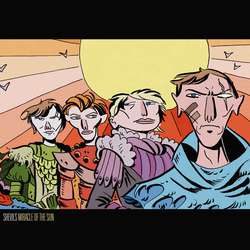
Shevils
Miracle Of The Sun
Shevils have a good nose for picking the artwork that graces their albums. This is album number three and this is their best pick yet. I really love the comic-feel this artwork gives me. The artist responsible for the cover this time around is Chris Faccone.
- Dennis
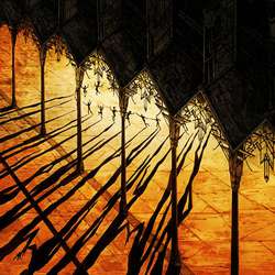
Pertubator
Lustfull Sacraments
Pertubator plays synthwave, a genre tag that usually drives me away from it. Lustful Sacraments has received some playing time. All because the gorgeous artwork by Mathias Leonard struck a chord with me. The composition, the colorscheme, it is just beautiful. I would love to see this in a way bigger format!
- Dennis
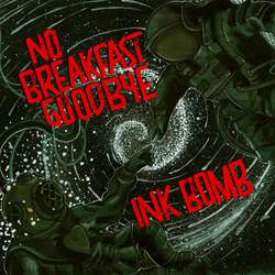
Ink Bomb - No Breakfast Goodbye
Split
The dark colors with the bright red lettering work like a charm. Jord Jansen created something simple yet elegant for this split album featuring Ink Bomb and No Breakfast Goodbye.
- Dennis

10.000 Years
II
10.000 Years, a Swedish stoner band have written an EP and now a full length about the crew of spaceship Albatros and their adventures. Chech there bandcamp-page if you want to know more about this story (or check their music). For now I urge you to check the beautiful artwork that graces the cover of II. Francesco Bauso of Negative Crypt Artwork made a piece of art that makes me daydream about crashing your spaceship somewhere.
- Dennis
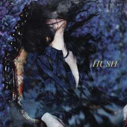
Slow Crush
Hush
Onetricpony made this artwork for Slow Crush record Hush. This type of artwork is really hit or mis for me. And most of the time the best respons you would get after showing something like this would be: meh... But not this cover. It has a very dreamlike quality that fits the record perfect, yet something about this makes it feel really strong at the same time. The only thing I am sure about is whether I like the placement of the album title. I think perhaps it would be even stronger if it was left of completely. Even with that minor flaw, this is something I can keep staring at.
- Dennis

Noltem
Illusions in The Wake
If you play black metal with some influences from the psych rock scene you better get your artwork straight. And that is what Noltem did. The play with colors reminded me a bit of works by De Ploeg. A scene of painters from early twentieth century from the north of the Netherlands. The result is something beautiful and I would love to see this in on a big canvas. Great work by Anthony Hurd!
- Dennis
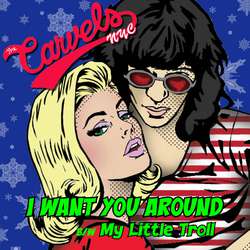
The Carvels NYC
I Want You Around (Independent)
This band has a good nose for great artwork. Where the live album left me slightly dissapointed (they did fix it on their bandcamp by adding some extra artwork) they are now back with a vengeance. Just look at this beauty! What can I say? I love this style and I absolutely dig the designs they choose. Of the two singles released late this year, this one is my favorite.
- Dennis
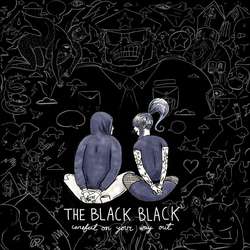
The Black Black
Careful On Your Way Out
I find comic-style art to be hit or miss with album covers. It's often bright and stark, but there's just too much going on. It can be a distraction instead of establishing a clear message. With the abstract background on this one, the eyes goes straight to the characters. The face an abyss, of sorts. Their expressions are hidden but we see their hands. It's intriguing and it sets a mood. It's positive, with the skull cop in the center, in large part due to the way the white pops out like a shining light.
This makes me want to check out the record see what it's about. Just like a cover should.
- Loren


